More detailed information regarding how to use Deed Engage's Explore and Edit modes for data analysis, including step-by-step instructions for data visualization and report creation.
In your Deed instance, admins will find a robust library of out-of-the-box reports and dashboards that help you manage your impact program and glean strategic insights. We understand that some admins want to go further — tailoring reports and dashboards for their specific programs, finding answers to one-off questions, or building views that reflect the way their team actually thinks about their data.
That's exactly what Explore Mode and Edit Ability are for. Explore Mode lets you make changes to a dashboard or report for ad hoc analysis or aesthetic customization, without affecting the original version that your team sees. We will walk through different functions available to analyze your data, and then two common analysis tasks you can accomplish using Explore Mode to dig deeper into your data. Edit Ability allows company admins to update existing dashboards and reports and save the updated version - either for their own future use, or with the rest of their team.
Key principle: Any changes you make in Explore Mode are yours alone. They will not overwrite the shared dashboard or affect what your colleagues see. See the related article "Explore Mode for Dashboards and Reports" for more information.If you want to make changes and share them with your entire team, you'll need Edit Ability — a separate permission level. See the related article "Edit Ability for Dashboards and Reports" for more information.
Edit Existing Elements
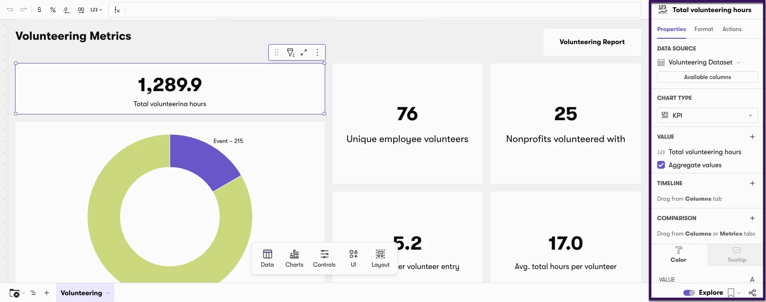
With Explore/Edit Mode active, you can modify any existing chart, table, or KPI tile on the dashboard or report.
- Click on the element you want to edit.
-
A settings bar will appear on the right-hand side of the screen. From this settings bar, you can update aspects of the dashboard/report, including:
- Colors and visual formatting
- Chart type (bar, line, pie, KPI, and more)
- Columns for comparison
- Property fields, axis labels, and tooltip settings
Add a New Chart (Bar, Line, or Pie) from the Plus Menu
In Edit Mode, you can add a brand new chart element to any dashboard or report using the plus menu. This gives you full control over chart type, data fields, and display options.
Note: If you already have a tile that closely represents what you are trying to create, duplicate and edit the tile to save time. Otherwise, follow the steps below.
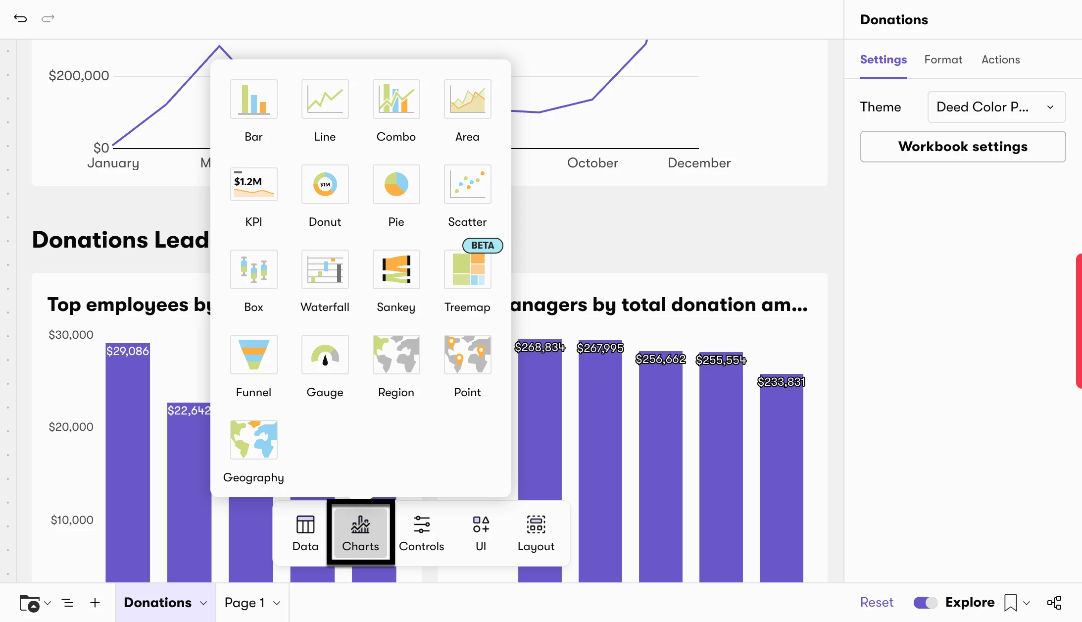
- Click the "Charts" icon to open the element type menu.
-
Select the type of element you want to add:
- KPI — A single headline number (e.g. total hours, total donors). Best for summary metrics at the top of a dashboard.
- Bar Chart — Comparison across categories (e.g. donations by department, hours by month). Requires an X-axis and a Y-axis.
- Line Chart — Trends over time. Requires an X-axis (ideally date-based) and a Y-axis.
- Pie Chart — Part-to-whole breakdown, for example showing total donations broken out by the percentage that each donation type comprises.
In Explore mode, the best way to add a new element to your dashboard/report is to duplicate and then edit an existing element.
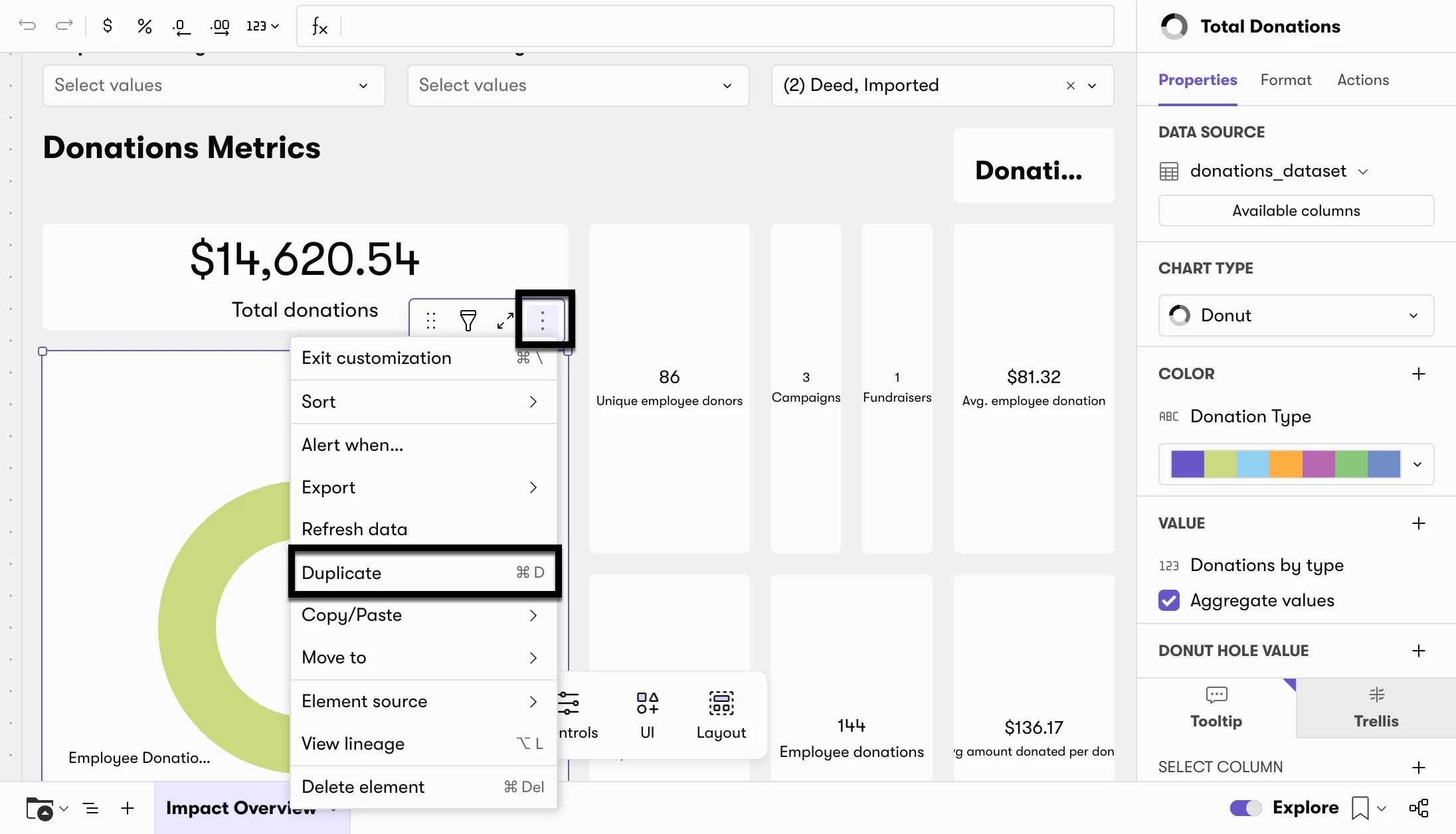
- Choose the data element closest to what you are looking to create (e.g. an existing table, pivot table, or visualization) and click the 3 dots in the upper right corner. Select “Duplicate.”
2. Edit the duplicated version as needed.
Configure your data visualization
The fields you need to fill in depend on the chosen chart type:
For Bar and Line Charts:
- X-axis: The category or time dimension (e.g. Department, Donation Month, User ID).
- Y-axis: The numeric measure to plot (e.g. SUM of donation amount, COUNT of participants).
- Color (optional): A second dimension to break bars or lines into sub-groups by color (e.g. Donation Year for year-over-year comparisons).
For Pie Charts:
- Slice dimension: The category each slice represents (e.g. Activity Type, Department).
- Value: The numeric measure that determines each slice's size.
- Display: Choose whether slices show percentage or number labels.
For KPI Tiles:
- Metric field: The single value to display (e.g. SUM([Duration in Hours]), COUNT DISTINCT([User ID])).
- Title: A short label that appears above the number.
5. Add tooltips and labels (optional)
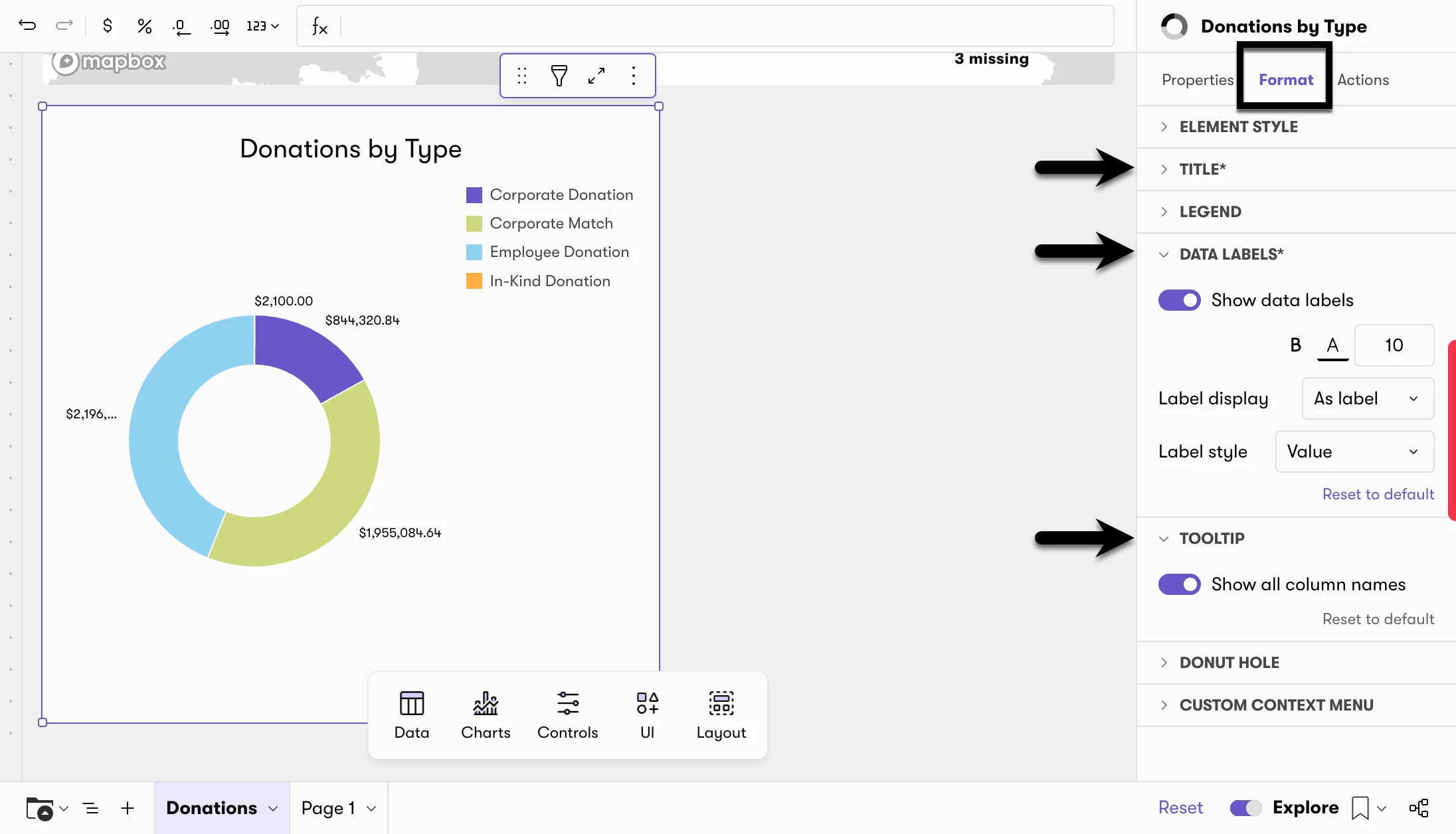
- In the customize panel, scroll down to find Tooltip settings. Tooltips appear when a viewer hovers over a data point.
- Add additional fields as tooltip data — for example, adding employee name to a chart grouped by User ID.
- For pie charts, toggle between percentage and number display in the label settings.
6. Title and position your chart
- Click into the title field of the new element and give it a clear, descriptive name.
- Drag the element to the desired position on your dashboard.
- Resize by dragging the edges or corners of the tile.
You now have a new chart built to your exact specification — without needing to leave Deed or open a separate BI tool. Bookmark the view when you're done so it loads automatically next time.
Add a Calculated Column
Explore/Edit Mode includes a formula editor that lets you create calculated columns in reports — similar to writing a formula in Excel. This is especially useful when you want to aggregate data, like summing total volunteering hours per employee.
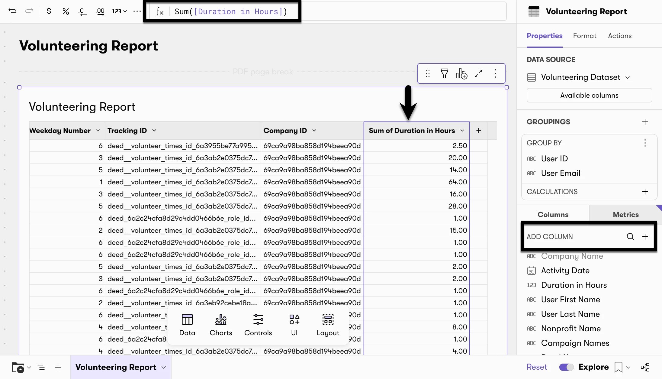
- Click the + icon under the Column section
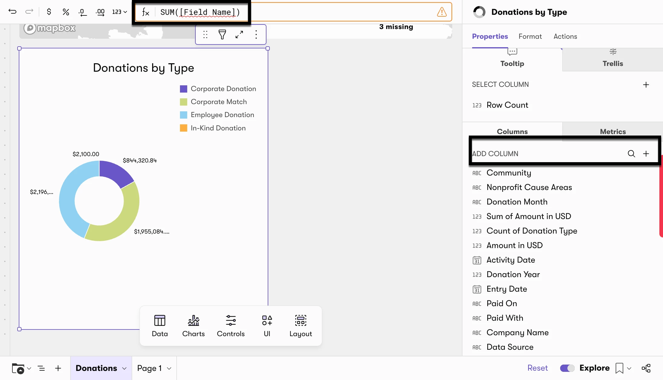
- In the formula editor, enter your formula. The syntax is similar to Excel. For example, Sum([Field Name]) for the sum of values in a column (field) of data. Common formulas include:
| Function | Description |
|---|---|
| Avg | Calculates the average value of a column or group. |
| AvgIf | Calculates the average value of a column or group when the specified condition is True. |
| Count | Counts the number of non-null and non-empty values in a column or group. |
| CountDistinct | Counts the number of unique non-null and non-empty values in a column or group. Does not count duplicate values. (Same as Ndv.) |
| CountDistinctIf | Counts the number of unique non-null and non-empty values in a column or group when the specified condition is True. Does not count duplicate values. |
| CountIf | Counts the number of non-null and non-empty values in a column or group when the specified condition is True. |
| Max | Retrieves the maximum (largest or latest) value in a column or group. |
| MaxIf | Retrieves the maximum (largest or latest) value in a column or group when the specified condition is True. |
| Median | Determines the median (midpoint) value of a column or group. |
| Min | Retrieves the minimum (smallest or earliest) value in a column or group. |
| MinIf | Retrieves the minimum (smallest or earliest) value in a column or group when the specified condition is True. |
| Sum | Calculates the sum of a column or group. |
| SumIf | Calculates the sum of a column or group when the specified condition is True. |
3. Replace Field Name with the exact name of the field you want to sum — for example, Duration in Hours for volunteering hours.
4. Click Save. Your new column can be added to the report/data visualization in which you added it.
Save a Personal View (Bookmark) in Explore Mode
Once you've customized a dashboard or report the way you want it, you can save that state as a personal view — sometimes called a bookmark — so it's ready for you the next time you log in.
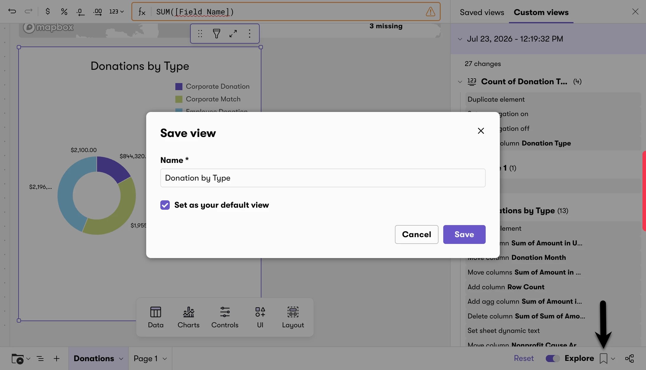
- After making your changes in Explore Mode, click the bookmark icon
- Select "Save as new view…"
- Enter a name for your view — for example, "Top Volunteers by Hours" or "Donations Month-over-Month."
- If you want this view to load automatically every time you open this dashboard or report, check "Set as your default view."
- Click Save.
|
📝 Note For Explore users, saved views are personal, so only you can see them. They will not be visible to other members of your team. You can change or remove your default view at any time by going to Manage Saved Views and deleting the saved view. |
Access your saved views
To return to a view you've saved:
- Click the bookmark icon.
- Select Manage saved views - a panel will appear on the right.
- Click any saved view to load it.
Access unsaved version history
Even if you forgot to save a useful analysis, Deed keeps a temporary history of your recent explored states.
- Click the bookmark icon
- In the panel that appears, click the Custom Views
- Select the date and time of the version you'd like to revisit.
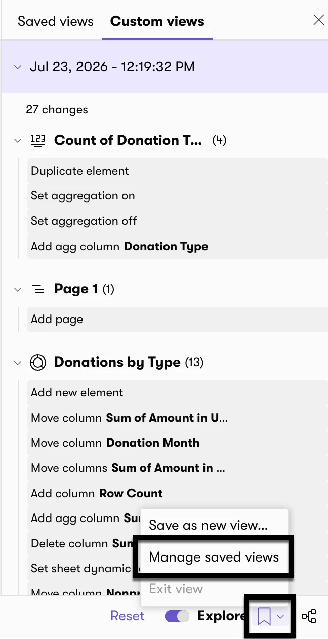
Bookmark menu reference
| Option | What it does |
| Save as new view | Saves your current explored state as a new personal view. Available only when viewing an explored state that hasn't already been saved. |
| Manage saved views | Opens the Bookmarks panel on the right, where you can view, load, or delete your saved personal views. |
| Personal views | Opens a submenu listing all of your saved personal views for quick access. Appears only when you have at least one saved view. |
| Clear views | Resets the dashboard or report to the original published version. Available when you are currently viewing a saved personal view. |
Reset to the Original Version
If you want to undo all your Explore Mode changes and return the dashboard or report to its original out-of-the-box state, click the Reset button in the lower-right corner of the screen.

|
📝 Note The Reset button only appears after you have made changes in Explore Mode. Clicking Reset will revert all unsaved changes — it will not affect any views you have already saved as bookmarks. |
Save a Personal View (Workbook) in Edit Mode
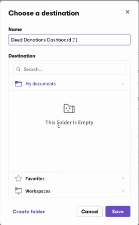
Click “Save As” from the bottom right-hand corner of the screen. A popup will appear from which you can select where you want to save the customized version of the dashboard or report. If you want the customized version to only be available to you, save it in the “My documents” folder.
Walkthrough 1: Find Your Top Volunteers by Total Hours
By default, the Volunteering Report shows one row per volunteer activity — so if one employee logged hours for five different events, they appear in five separate rows. This walkthrough shows you how to group those rows by person and calculate each employee's total hours, so you end up with a clean ranked list — ideal for volunteer recognition programs, top-100 reports, or end-of-year summaries.
Step 1 — Open the Volunteering Report and activate Explore Mode (if applicable)
- From the left navigation, go to Reports → Volunteering Report.
- Click the Explore toggle in the lower-right corner of the page if applicable. It will turn purple when active.
Step 2 — Group by User ID
- Find the field search bar (look for the magnifying glass icon in the data panel).
- Search for User ID.
- Drag User ID up into the Groupings section. Your report will now show one row per employee rather than one row per activity.
|
💡 Why User ID and not User Email? User ID is the unique identifier for each employee in your system. In rare cases, multiple employee records can share the same email address. Grouping by User ID first ensures every row is truly unique — then you can bring in User Email for readability. |
Step 3 — Add User Email for readability
- Search for User Email in the field search bar.
- Drag User Email into the groupings area alongside User ID. Each row now shows the employee's email in the column next to their User ID so you can easily identify who is who.
Step 4 — Create a calculated column for total hours
- Click the plus (+) icon in the column header area.
- Select New Column.
- In the formula editor, enter: SUM([Duration in Hours])
- Click Save. A new column will appear showing total volunteer hours per person.
|
📝 Note — Expected vs. completed hours By default, the Volunteering Report shows expected hours. If you want completed hours only, apply the status filter at the top of the report before running this analysis. |
Step 5 — Sort by highest hours
- Click the header of your new total hours column.
- Click the three dots and then "Sort."
- Select Sort Descending (highest to lowest). Your top volunteers will now appear at the top of the list.
Step 6 — Collapse the rows for a clean view
- On the left-hand side of the report, find the minus (−) icon.
- Click it to collapse the grouped rows. This contracts the detail rows and gives you one clean summary line per employee. You can click the (+) sign to expand and see each volunteer entry from each employee.
You now have a ranked list of your employees by total volunteer hours — ready to export as a CSV or Excel file, or bookmark for future use.
Walkthrough 2: Build a Donations Month-Over-Month Bar Chart
The out-of-the-box Impact Overview Dashboard gives you a snapshot of total program activity, but it doesn't show month-over-month trends in a single chart. This walkthrough shows you how to build a bar chart that displays donation totals by month — with the option to add a year-over-year colour comparison. The Impact Overview Dashboard is the best starting point for this because it's the only dashboard that contains donations, volunteering, actions, and engagement datasets all in one place, which gives you the most flexibility.
Step 1 — Open the Impact Overview Dashboard and activate Explore Mode (if applicable)
- From the left navigation, go to Dashboards → Impact Overview.
- Click the Explore toggle in the lower-right corner if applicable. It will turn purple when active.
Step 2 — Duplicate an existing donations chart
- Find an existing donations chart tile on the dashboard.
- Click the three dots (⋯) in the upper-right corner of that tile.
- Select Duplicate. A copy of the tile will appear on your dashboard.
Step 3 — Change the chart type to Bar Chart
- Click on the duplicated tile to select it.
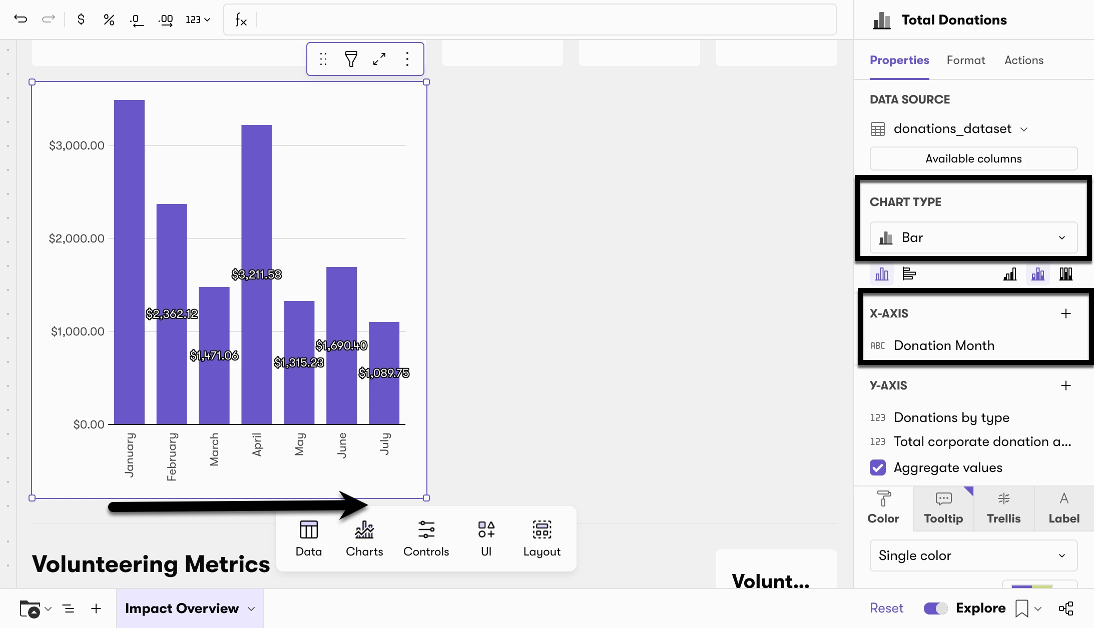
- In the customize panel on the right, find the chart type selector.
- Select Bar Chart.
Step 4 — Set the X-axis to Donation Month
- In the customize panel, find the X-axis field.
- Set it to Donation Month. This is a pre-built date field — do not use raw activity date, as it will not group cleanly by month.
|
⚠️ Months will appear in alphabetical order — here's how to fix it When you first add Donation Month to the X-axis, your chart will display months alphabetically (April before January, etc.). To put them in the correct chronological order: 1. Find the hidden field called Month Number in the field list. 2. Unhide it by clicking the visibility icon next to it. 3. Click Sort on the chart and select Custom Sort. 4. Sort by Month Number, Smallest to Largest, and Aggregation = avg. Your months will now display in chronological order. |
Step 5 — Set the Y-axis to total donation amount
- In the customize panel, find the Y-axis field.
- Set it to your donation amount field using a SUM aggregation (eg. SUM([Net Amount in USD]). This will show total donation dollars (or units) per month.
Step 6 — Add a year-over-year color comparison (optional)
- Add Donation Year to the x-axis.
- In the customize panel, find the Color dimension field.
- Set it to Donation Year.
- Important: Once Donation Year is added, check that it is set to truncate at the year level — not day. If it shows "Day of Donation Year," right click the field and change the truncation to Year.
- Toggle on Show Legend so that each year's color is labeled in the chart.
Step 7 — Choose stacked or grouped bars
- In the bar chart settings panel on the right, find the stacking option.
- Choose No stacking to show each year's bars side by side, or Stacked to show them combined. If you only have one year of data, this setting has no visible effect — choose whichever you prefer.
Step 8 — Add a chart title
- Click directly into the chart title field at the top of the tile.
- Enter a clear name — for example: Total Donations by Month or Donation Trend — Year over Year.
Step 9 — Reposition the chart on the dashboard (optional)
- To move the new chart to a more prominent position, click and drag the tile to the desired location on the dashboard.
- To resize the tile, drag the edges or corners.
- To create space for the new chart alongside existing tiles, drag existing tiles down or to the side.
You now have a month-over-month bar chart showing donation totals, optionally color-coded by year. Bookmark this view so it's waiting for you at the start of each reporting period.
Related Articles
- 🗺️ Explore Mode for Dashboards and Reports — Overview and feature reference
- 📝 Edit Ability for Dashboards and Reports — How to share customized views with your team
- 📈 Dashboards — Out-of-the-box dashboard guide
- 📈 Reports — Out-of-the-box reports guide
Comments
0 comments
Please sign in to leave a comment.